Aurelium Ops case study
Glacier Tile
A regional tile company repositioned through a distinctive mountain-and-mosaic identity built for credibility and recognition.
01 · The challenge
What needed to change.
Glacier Tile needed a professional identity that reflected Northwest Montana craftsmanship without blending into familiar local mountain branding.
02 · The strategy
The idea organizing the system.
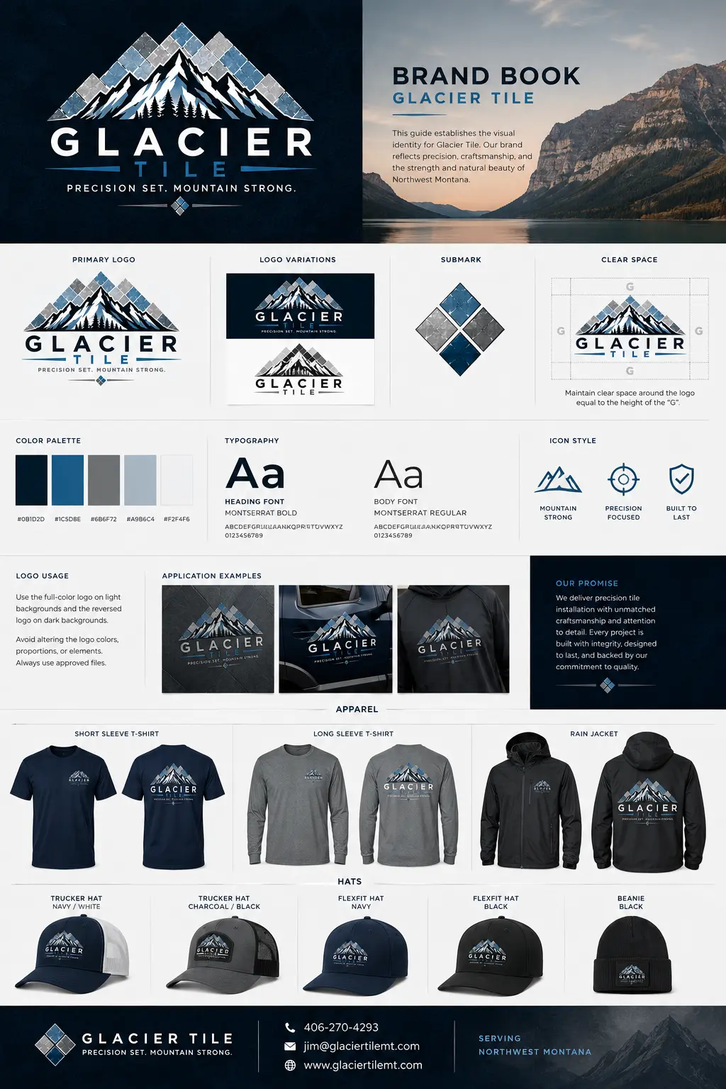
We connected precision tilework with the strength of the surrounding landscape, using a mosaic-inspired mountain silhouette and a clear positioning idea: Precision set. Mountain strong.
03 · The system
How the strategy became usable.
- Primary identity, alternate marks, and responsive submark
- Mountain blue, slate, charcoal, and white color system
- Business cards, workwear, hats, vehicle, and digital applications
- Usage guidance designed for light and dark environments
04 · The impact
Built for the real business.
The resulting system gives the business a recognizable regional presence while remaining practical across jobsite, apparel, vehicle, print, and web applications.
The work in the world
Explore the complete brand experience.
Open any image for a closer look, then move through the identity, digital, apparel, collateral, and environmental applications.
Explore more work
Start with clarity
Your next stage deserves a brand built for it.
Begin with a focused conversation about your growth stage, brand gaps, and the business outcome the work must support.
Request a strategy conversation