Aurelium Ops case study
Summit Peak
An architectural mountain identity built to position a Northwest Montana builder with confidence and clarity.
01 · The challenge
What needed to change.
Summit Peak needed to look established and design-conscious in a crowded mountain-building market without relying on a predictable rustic badge.
02 · The strategy
The idea organizing the system.
We translated precision, elevation, and regional character into a geometric summit mark, disciplined wordmark, and refined construction palette.
03 · The system
How the strategy became usable.
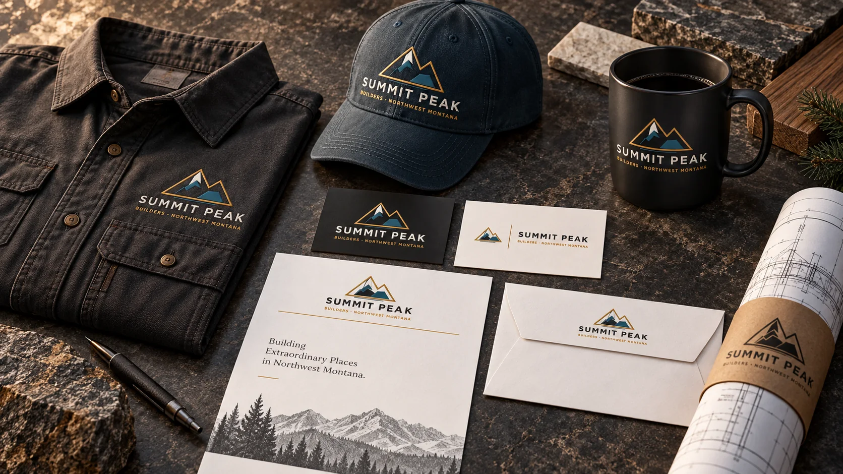
- Geometric mountain signature and responsive mark
- Charcoal, alpine blue, bone, and warm gold palette
- Business cards, letterhead, envelopes, and plan sleeves
- Workwear, cap, and coffee mug applications
04 · The impact
Built for the real business.
The brand gives Summit Peak a credible, premium presence that works equally well in a client presentation, on-site, and across everyday business materials.
The work in the world
Explore the complete brand experience.
Open any image for a closer look, then move through the identity, digital, apparel, collateral, and environmental applications.
Explore more work
Start with clarity
Your next stage deserves a brand built for it.
Begin with a focused conversation about your growth stage, brand gaps, and the business outcome the work must support.
Request a strategy conversation